Flop to Fixed!
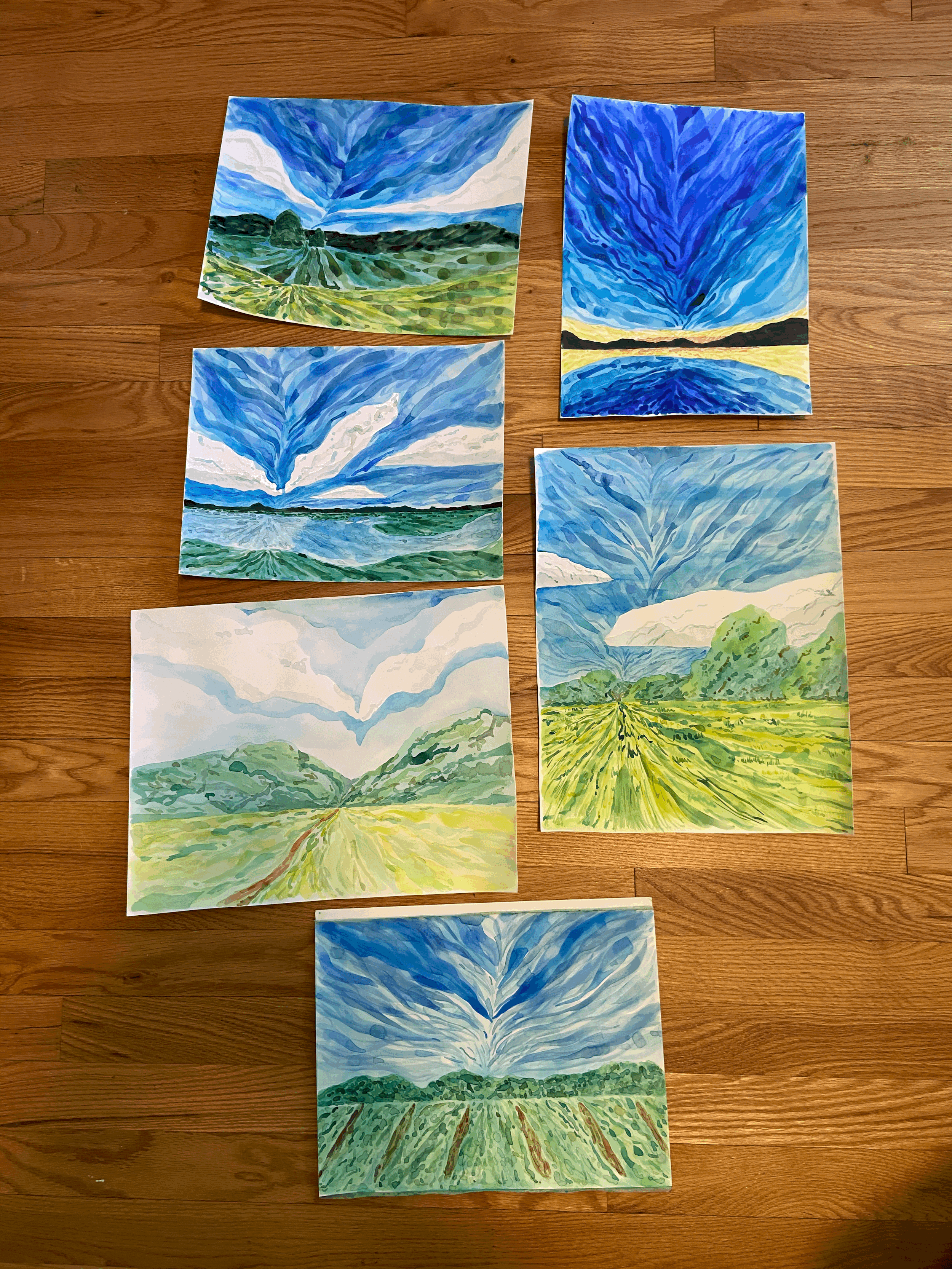
So the story starts with this watercolor collection I am working on:
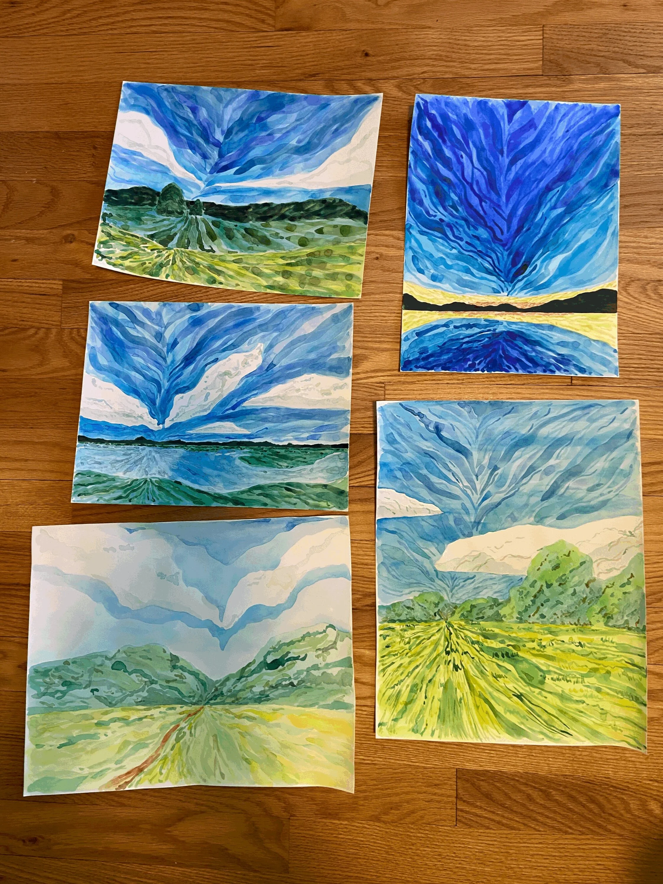
With each of these pieces I wanted to use bits of color to create drama and movement emanating from a focal point.
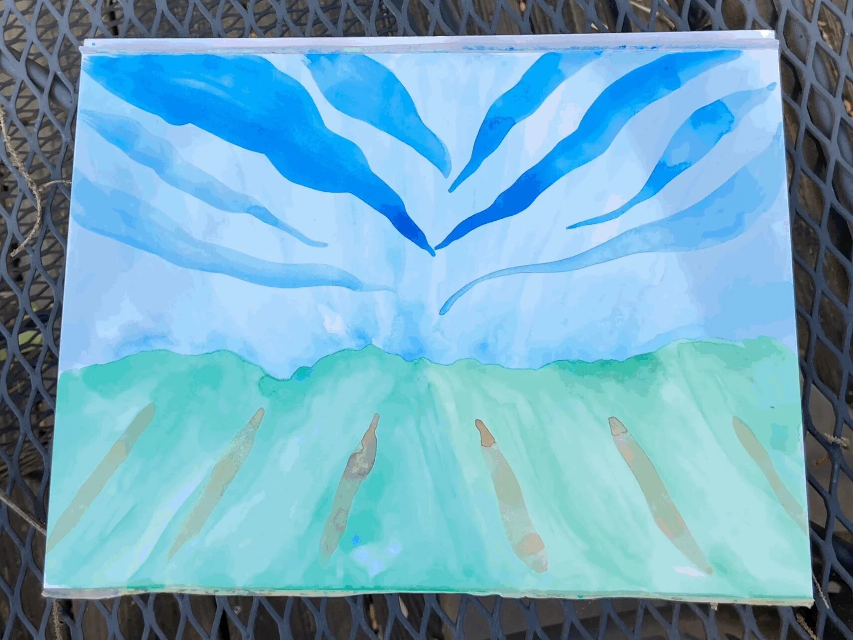
Which leads me to this piece:
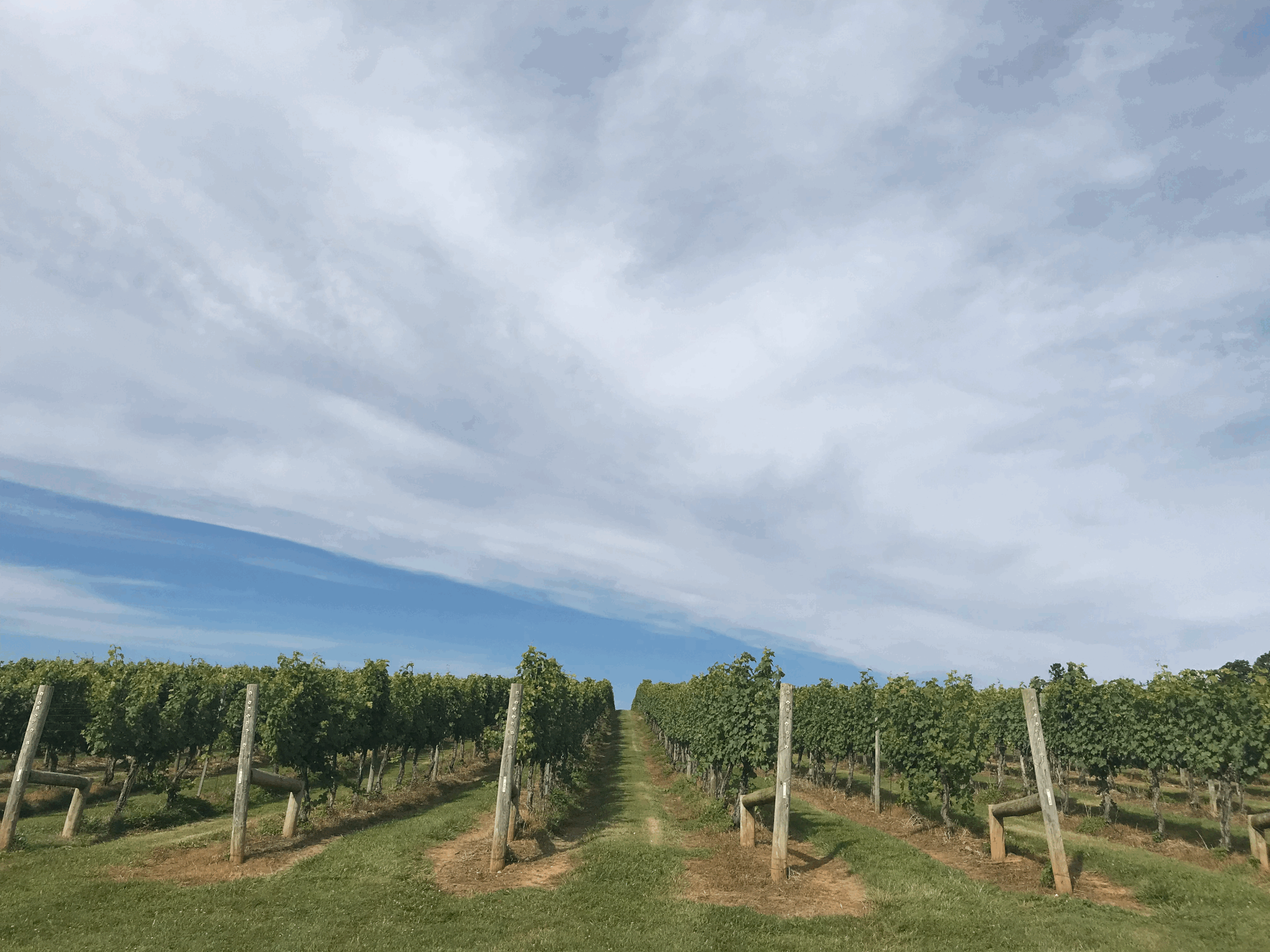
Here is the reference photo. I took it at a vineyard (I don’t remember which one) while my husband and I were celebrating our first wedding anniversary in Charlottesville, VA.
I noticed a couple of problems in my painting. The first was the sky. I didn’t like the strong blue marks I had made, and I was not sure how to make them blend. I also wasn’t sure how to work in the brown vineyard marks.
I started by doing two things. First, I created a space for trees in the distance by adding a horizontal line of green. To do this without making pencil marks on the painting I took my T-square ruler and painted close to the ruler without touching it. I also added more blue to the sky. At this point I’m REALLY not sure how I am going to save this painting.
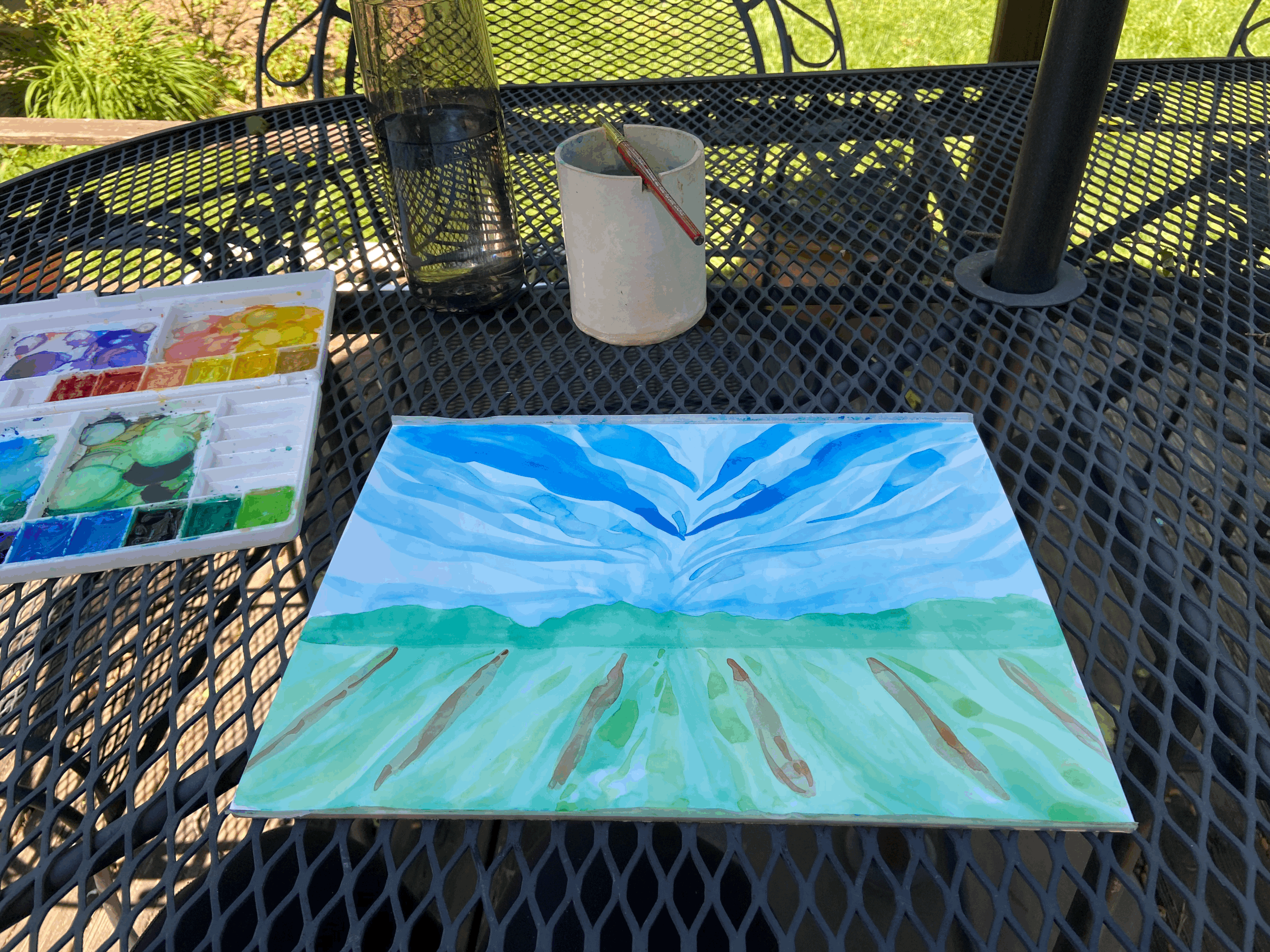
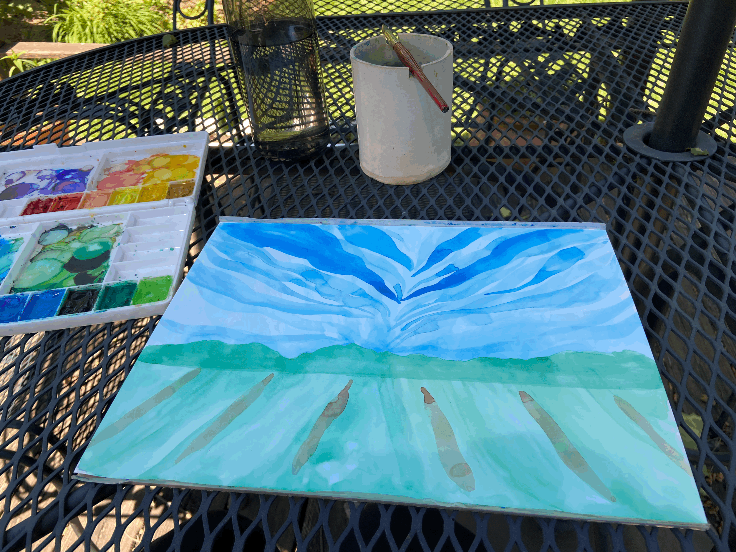
I then added some lighter green to the foreground to add some light. In this collection, I’m working on creating marks by varying the pressure I use on the brush. As I’m painting, I’m thinking about the energy I want to have in the piece and have that energy coming from a point.
One thing I have learned in the creation of this collection is that it is important for the first layer of paint to follow the energy you want to have in the piece. By that I mean that if I want to have marks emanating from a point, I need to make sure that the under layers of the painting follow those those same directions, otherwise you can tell.
So as I’m working, I am thinking about how I want the sky to work. If you look at the sky, it is lightest at the horizon, and then gets bluer and deeper above your head. As I’m working, if I notice that the paint is pooling too much and becoming too intense, I will pull the color with my brush to make the mark more transparent. This also makes the mark bigger, but it is usually something I can work with. You can also change the intensity by picking the paint back up by rinsing your brush, wiping off the excess water on the side of your container, and then touching your brush to the paint again.
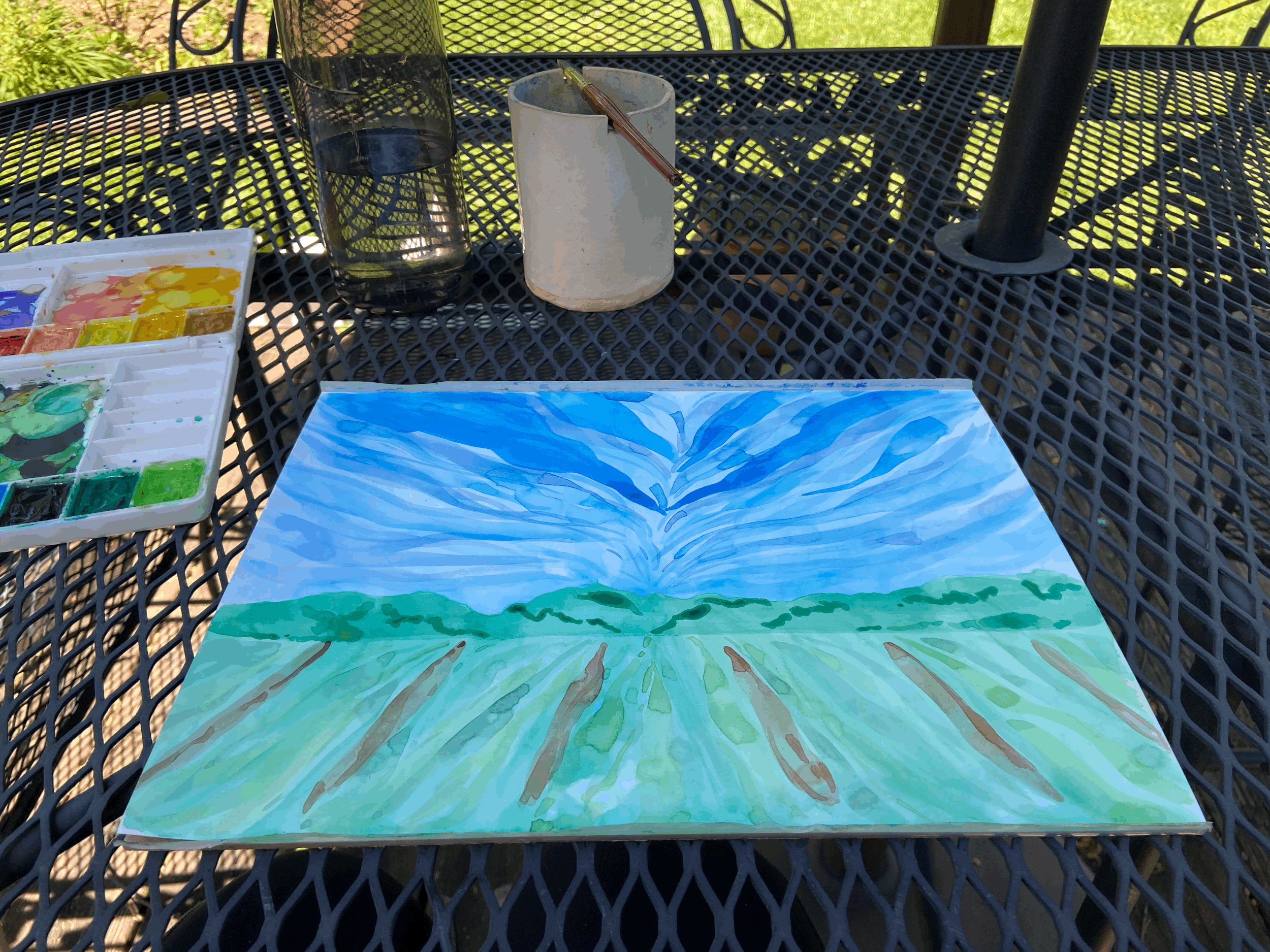
I then think about the trees in the distance. Sure, they don’t appear in my reference photo, but I think they work. I’m thinking about how shadows would look on the trees from a distance and how I can recreate that effect with the style of marks that I am making. These marks and lines have different start and stop points, and they don’t obviously come from the point of energy that I am working with, but I think they work. I have also started to add more brown to the rows of vines.

This is the brush I used for this piece
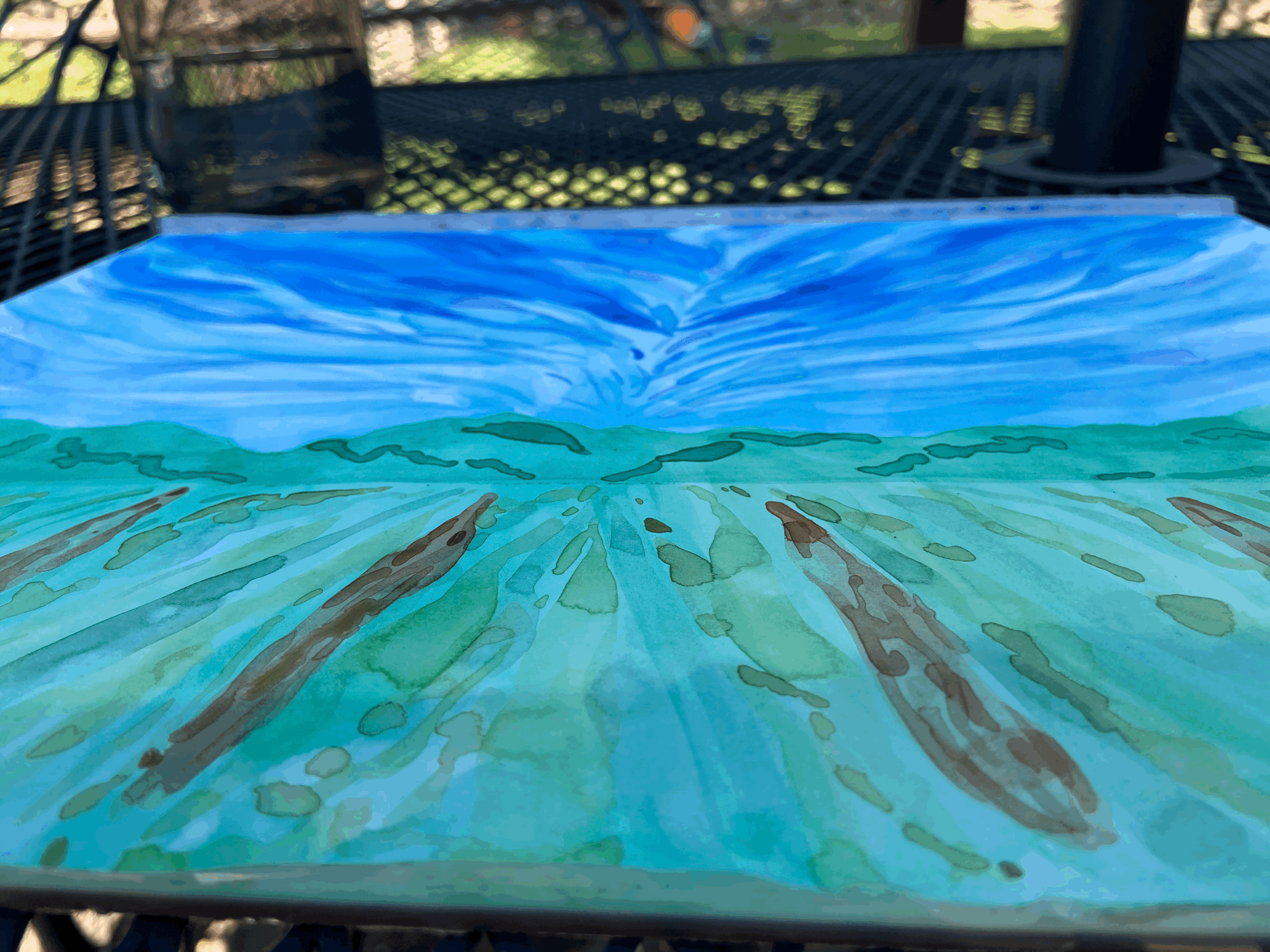
Working on adding more detail to all the parts of the painting. Because I was working outside I hopped back and forth between the sections of the painting to allow the paint to dry between colors.
There are little areas where the paint has dried in puddles and left water marks or rings of color. I don’t think you would want them in a fancier watercolor painting, but I enjoy them in this setting. I think they add a little character and movement and interest to the piece. They also appear in the other pieces in this collection, and I think they make a secondary pattern in each picture and add more movement.

At this point I have added more blues and purples to the sky to try to blend the dark blue marks from the beginning into the lighter horizon. My thought is to keep adding colors and marks to the painting until it looks better.
I’m wondering if I’m done at this point. I put it next to the other paintings in my collection to compare them. I was looking to see if the level of detail and the style were consistent amongst the paintings.
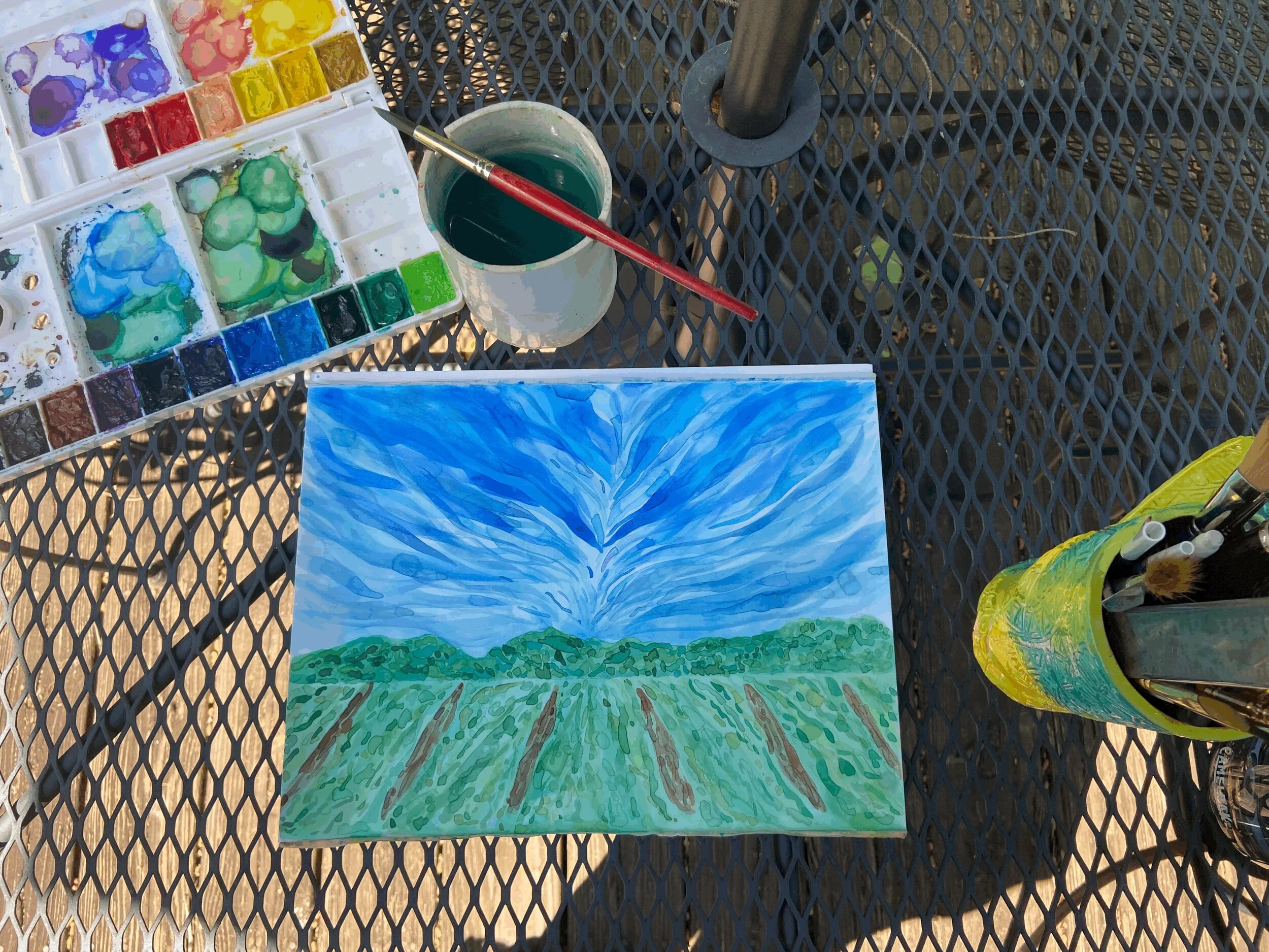
I decided it needed a little more detail before it was finished.
After I was finished I realized I didn’t add clouds. Because this is watercolor, I block out space for clouds before I start painting. Adding clouds could have helped blend the strong blue marks from the beginning of the process in a more natural way. The clouds could have gone next to the strong blue marks and separated the lighter horizon from the deeper sky, but that would have had to be decided upon at the beginning of the piece.
Overall I am really happy with how this piece turned out. I was really glad that I was able to save it! And I think it fits in just fine with the rest of the collection.
It might not match the reference photo exactly, but I’m happy with how it turned out. I have been enjoying taking pictures from my travels and translating them into art within the lens of this style of painting. It has been a fun way to reminisce about pre-COVID times and translate what I have seen into an artistic interpretation.